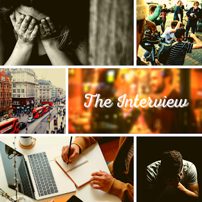
Aesthetics for "The Interview"
Hello and welcome back.
Because of various degrees of procrastination I thought I would write a little bit of an unusual post. Well, unusual for me. Or shall we say, a new kind of post.
Ever since I started writing, I loved to create mood boards, vision boards, aesthetics or whatever you would like to call them. I never share them with anyone, I never use them for anything other than my own inspiration and thought process.
Today, however, I decided to show them to you, one because I am planning on writing an installment of "A guide you don't have to follow" on vision boards, two because I edited and reuploaded this particular story to Wattpad and I thought maybe I can get at least one more reader out of this blogpost. #selfpromo
By no means am I saying that these are great quality pictures, I truly don't think they can compete with some of the amazing work out there but they don't have to for my purposes.
So without further explaining, let's look at some of the aesthetics that I created for my romance novel "The Interview" over on Wattpad.
1. Character Aesthetics
These two are specifically created for my two main characters, Alexandra Schneider and George Oscar. They try to capture a little bit of the essence of the two characters and give a feel to what you might expect when reading about them in the novel.
 |
| Alexandra Schneider |
The quote is taken directly from my novel and is a direct response to the one used in George's aesthetic. It gives a hint at what kind of story, a romance that deals with the question of desire and want as much as the issues this want can cause. It is not a happy sappy quote, but a tensed, conflicted one (at least to me, who knows the story, it appears like that)
 |
| George Oscar |
The quote in the biggest picture is directly taken from my story and it is one of my favourite lines (and scenes) of his. It creates a tension within the picture without spoiling too much of the story (at least I hope not) and also breaks up the otherwise very cluttered picture.
2. General aesthetic
I wasn't sure if I should share this one because not much thought went into it, but then again, this post is all about what I use as inspiration. So here we go:
 |
| The Interview aesthetic |
I also tried to keep the amount of individual pictures relatively low because otherwise it might get too overwhelming. For the full selection I use my Pinterest boards which have hundreds of photos separated into individual parts of the story.
I hope this made you interested in my upcoming post about mood boards and aesthetics and maybe it made you want to read The Interview :)
If it caught your interest, here is the link: https://www.wattpad.com/story/96605926-the-interview-english-completed
If it caught your interest, here is the link: https://www.wattpad.com/story/96605926-the-interview-english-completed
I don't typically share these aesthetics on Instagram or Twitter because I'm never too sure about copyrights and stuff, but if you would like to see more of them then let me know somehow and I might share versions with royalty free images.
Anyway, that was a very long way of showing you three pictures. If you read until now, thank you, I really appreciate it. I've really been trying to blog more (mostly by prewriting posts) and I hope you noticed my efforts.
Take care and write on,
Lena
Follow me and stay in touch:
Twitter: @lena_fiala
Instagram: @lena_fiala_
Business inquiries: lena.fiala99@gmail.com
Twitter: @lena_fiala
Instagram: @lena_fiala_
Business inquiries: lena.fiala99@gmail.com


Comments
Post a Comment